28 Apr 2013

First Look Book Review: Vader's Little Princess


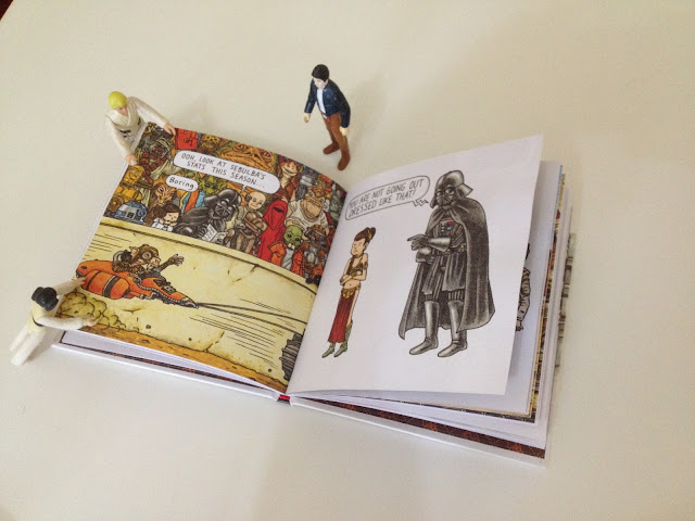
Here at IR towers it has been a hectic week but we have something of a real treat right now for you with a first look and review of the wonderful Vader's Little Princess by Jeffrey Brown.The delectable people at Abrams and Chronicle sent us over a copy to show you guys as I'm sure everyone here knows and appreciates Jeffrey's work.

So lets get to it then, Vader's Little Princess is "the irresistibly funny follow up to the breakout bestseller Darth Vader and Son" so reads the press release, but hey if my job was to re-hash press releases I'd work in games...

This book is the sequel to one of the most elegantly executed viral breakouts that illustration has seen in the last few years. The extremely talented Jeffrey Brown has redefined what success for an illustrator looks like,  we can all take note, talent sells and you just have to be out there and keep on it. Cracking the mainstream gives you the freedom to do what he wants, which in anyone's book is a good thing. His charming work for Vader and Son was picked up the world over for both it's gentle truthful humour and brilliant subversion of one of the most recognisable pop culture villains of our generation, so in reviewing the sequel I'm mindful of the fact he has really tried to build on the formula with Vader's Little Princess and not just release a cash cow.

The book itself is lovely, crafted with care and slickly presented, Jeffrey Brown's illustration is top end. His work is both charmingly concise allowing the humour and humanity of his characters to shine through but also detailed in a Raymond Briggs sort of way that gives the viewer a real visual feast and classic children's book feel. He really is great at capturing character and expression which is a rare skill to master with simple line work and pared down characters. It's a really clever thing to get so much emotion into Vader, considering the full face helmet, this is the real key to the appeal of the series.

I feel like there is more character development here than the films as we have a beautiful selection of classic first world problems that is painfully familiar. This ease of understanding and universality strikes a chord with the arcade kids now grown up, his style, the icing on the cake.

Deliciously funny and bang on my demographic, what's not to love.

Vader's Little Princess is by Jeffrey Brown
Published by Chronicle Books
Available 4th May (National Star Wars Day!)


15 Apr 2013

Artist 149: Artur Borejszo / Aleksandar Hrib


We have a real treat in store for you guys today with some exceptional sculptural illustrations from multi-talented duo Artur Borejso and Aleksandar Hrib who's work brings in a variety of influences and techniques to create something incredibly unique, a blend of 3d and 2d with sharply perfect polys butting up against linework and character design. Their collaboration is called  (IN OTHER WOR(L)DS) and the first thing that is so striking about the duo's work is the unparalleled sense of scale that comes with the territory of 3d design and expert architectural knowledge. This is one of the strongest features of their work as it breaks down horizons and unwraps the possibilitys of digital and graphic design.

There is something epic about their work. It breaks skies and bends worlds in a way that only 3d can but the 2d is not forgotten or detracting it is the subject, the canvas is a unique world the subject unreal characters and expressions. This may be a product of duo but it feels every bit like a single moulded unit. These two are not dabbling they mean business and exude talent. Someone will snap them up and we wish them the very best in the future.

Who are you:
Artur Borejszo / Aleksandar Hrib

What do you do / How did you start:
Artur Borejszo obtained his architecture and architectural engineering degree from the Technical University of Lodz, Poland with distinction. In addition to that, he developed special 3D CAD computer skills through completing courses and seminars at expert training centers.

Aleksandar obtained his master of architecture at the Belgrade University in 2010. Aleksandar’s skills and interests range from architecture to film and photography.

A Personal statement about you or your work:
We are combining 2D and 3D work. We are blurring boundary between architecture and graphic design, painting and sketching, computer and hand drawing. The result is a unique technique combination of sketch elements like trees, plants, characters inside 3D that is used as a tool for creating surreal scenes of dreams and poetry. Since the introduction of 3D software everyone has been producing images through computers massively. After an era of digital excitement the hunger for craftsmanship was bigger than ever.

In this image we do not exclude neither techniques, but merge both.

Links:
Artur Borejszo

11 Apr 2013

Artist 148: Masha Manapov


Next illustrator up, and we have now the super talented and brilliantly alliterative Masha Manapov. based in sunny Tel Aviv Masha's work has an instant likeability that stems from it's excellent construction. Masha has a great eye for composition and a focused approach that creates a well rounded and visually satisfying image. She puts just enough to tell the story without being sparse and at the same time her work is rich but never over complicated or contrived. Her work both exudes clarity of vision and marries together found elements without resorting to the standard vintage kitsch that is so prevalent. Her work is like a breath of cool air, refreshingly different but with a chilling edge that becomes more apparent as you stay longer as the viewer. Very technically accomplished and one that will surely find her place with her distinct yet saleable style. So with the best of wishes for all she does, and no more faff from me it's Masha Manapov.

Who are you:
I am Masha Manapov. Designer and illustrator currently based in Tel Aviv, Israel.

What do you do:
Graduated from the Bazalel Academy of Art and Design with a major in illustration (BA 2009) my work focuses mainly on editorial illustration for the press. Recently I finished working on my first children's book that will be published soon. I also participated in a group exhibition and in a collaborative project that produced an illustrated booklet.

In the near future I would like to focus on self initiated projects with social and environmental character.

How did you start:
As many others, I started drawing at a very young age but as a very pragmatic person, I've never considered to make a profession of it. When I had the urge to express myself I translated it into words, photography and artistic paintings. Only at my senior year at university, I started to use illustration as a tool and to see everything in pictures. After graduation and a one year cooling period I made a portfolio and started working.

A Personal statement about you or your work:
I believe that the visual always needs to be more than just a decoration, therefore for me an idea is always a starting point. I work in a collage technique because I love to "glue" different objects and ideas together; there is always a great discovery. I use dreamy and surreal elements to talk about daily and relevant issues and try not to take myself too seriously.

Links: