27 Jul 2011

Artist 101: James Boast


Feature time again, and its a real treat for everyone today. We have the marvellous James Boast, who has a real sense of style and an accomplished working practice, just one of a clutch of hard working illustrators coming through Middlesex University at the moment, and James like the others we have featured benefits from joined up thinking when it comes to promotion and getting started whilst still studying. It will soon become standard practice for those intending to carry on into the industry to start earlier and poach clients even as they  down drinks on freshers week. It's a pleasure when we have someone here to feature who has all his bases covered like James. He has a good solid style which is the a great standpoint from which to launch a career, his use of moody marine colour really compliments his line and whilst he has a style it's great to see he is not a slave to it. One for the future he will surely be up there competing with others in his genre and as he explores and grows I'm sure he will keep developing with the confidence and intelligence his work already shows. So read on for more about this up and coming artist.


Who are you:
 I am James Boast.


What do you do:
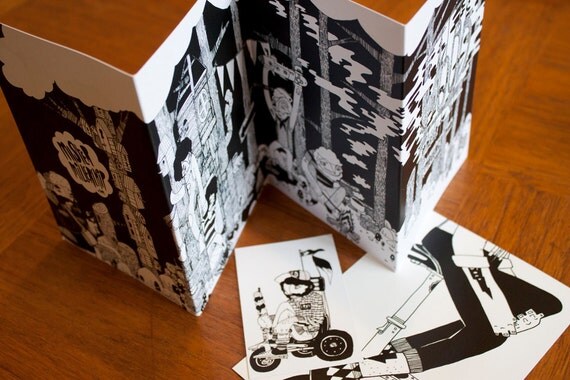
I'm from Kent, but live in London. I founded FatbreadZine, a quarterly publication and I am a freelance illustrator.


How did you start:
I began a Btec in Art & Design after school and applied at Unis to study Fine Art, but the summer of that year brought a lot of doubt into my mind as where Fine Art could take my work. So I drew more and procrastinated and I eventually decided to take a Foundation Degree in Art & Design. This extra year was to help me make sure I was making the right decision.


Through this year, I learnt a lot about my work, my inspirations and different practices. After a couple more viewings of university I was sure I had made the wrong decision with Fine Art and Illustration was for me.


After three years of studying Illustration at Middlesex University, I am now a freelance illustrator. I got the ball rolling by doing some album work and some editorial work for Avantoure Magazine and I am currently doing illustrations for a children's book.


A Personal statement about you or your work:
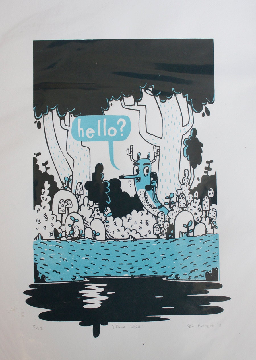
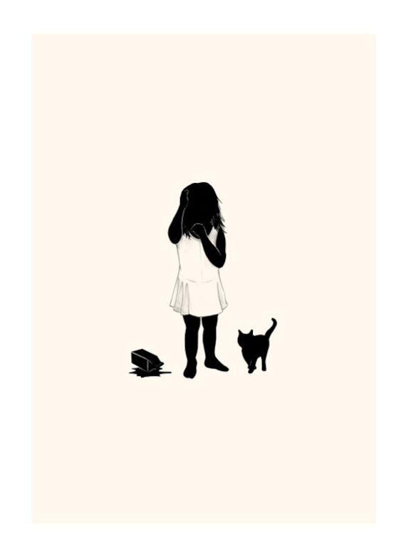
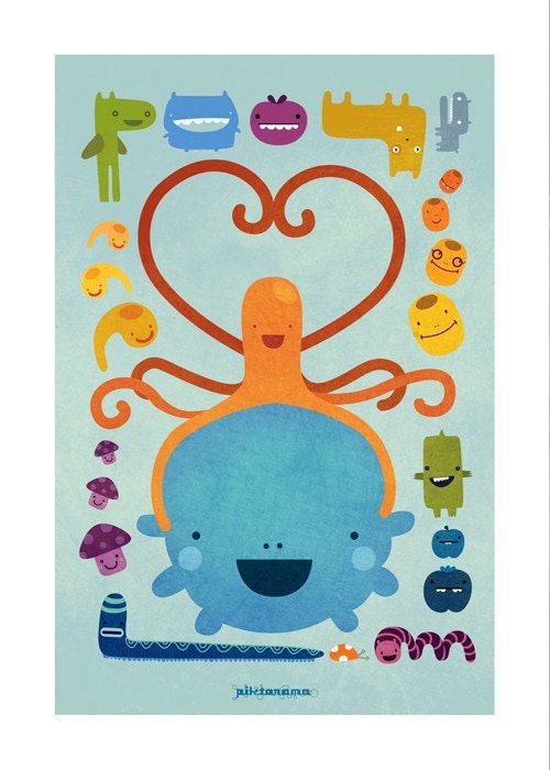
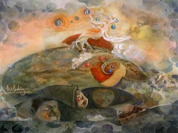
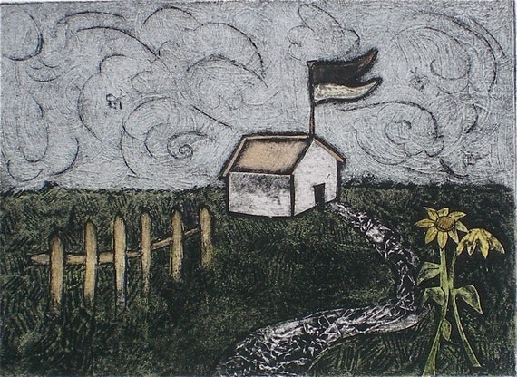
I like to create images that have atmosphere and depth, I love images that tell a story. I hand draw all of my images, and then render them with colouring and textures in photoshop.


Links: 
portfolio 
blog 
twitter 
fatbread zine blog 
fatbread zine twitter

25 Jul 2011

Artist 100: Dale Edwin Murray


Keeping it short and sweet today with the ultra concise Dale Edwin Murray, and with an ability to say so much through his work it's understandable he can be as reserved as he likes! Dale's work is jam packed full of attitude, with its own dynamism that really gives it that little bit extra to make it stand out. The union of crisp lines, ace textures and a natural talent for colour use gives Dale's work the edge it needs to stand up in a crowd. Inspired by classic and retro images, it is easy to get lost when harking to the past but Dale keeps things fresh with cool clean lines and despite the classic and recognisable style he brings things up to date by his fresh but stayed palette and his use of texture. His work is very palatable and easy to consume, with an openness and a clear message. He doesn't dilute but sticks to his guns and gives us a tasty treat every time. His work is considered with a nice attention to composition and balance, this gives his work that box fresh appeal which is something that will serve him well in the future. Well without further ado, it's Dale Edwin Murray.


Who are you:
I'm Dale Edwin Murray.


What do you do:
I'm a freelance illustrator.


How did you start:
I started by designing t-shirt graphics and then moved into editorial illustration, greetings cards and art prints.


Personal statement:
My work is inspired by mid-century art and design and the quirks, idiosyncrasies and textures of screen printing.

Links:
portfolio

Typography Rally submissions open

Illustration by Natsuki Otani

Hello all, the rally wouldn't be the same without some more open submission goodness for you guys to get your teeth into and your creative juices flowing. And it is with this aim that we are really happy to announce our latest rally. This three week open submission event aims to give you a chance to stretch your typographic muscles and show some of your hidden talent for the art of words. From time to time everyone experiments with text and whether you are a digital font expert or you love to cut, stick and scribble we want to get your text! As usual the usual rules apply, all rights are your own and we will publicise the hell out of all our posts do grab your pens pencils and styluses and get your funk on. As usual to keep it fresh we have some different themes throughout our three week rally. So if this takes your fancy and we hope it does please check out our submission guidelines and send us a text, don't worry it doesn't have to be new work. We are more than happy to show what you send! :)


Digital Typography: Monday 1st to Sunday 7th of August 
This is for you font meisters who engage in the dark vector arts, show off your text and your style over the first week of our Typography summer event. We can't wait to see your original fonts to keep us cool as we burn in the semi relentless, not so ruthless heat of the English summer.


Hand drawn Fonts: Monday 8th to Sunday 14th of August 
This is the place for all your hand drawn, cut out or constructed work, and we are really looking forward to seeing some really original and fun designs. So however you do it we would love to see it and don't forget to send us your links so we can shamelessly promote you!


Happy Birthday: Monday 15th to Sunday 21st of August
Whilst not technically our birthday, nevertheless we would love you to put pen to paper or pad and show us how your type does it's job. So please give us a lovely typographic birthday card, you can use any methods or media you like, simply follow our submission guidelines and have fun.


Submission Guidelines 
  • Please state which part of the rally you would like to appear in, when submitting your entry
  • Low res jpeg file please (72 dpi is good enough) as this is web quality, and my decrepit PC will die otherwise
  • Don't forget to send us the links to your portfolio sites, (blog, facebook, flickr and etc) if you are sending us your product, send us a link to the pages you are selling your products.
  • Send us a link to your twitter account if you have one, so I can promote you on twitter effectively.
  • Please send your work to illustrationrally[at]hotmail.co.uk with the title "Typography Rally"

20 Jul 2011

Artist 99: Michalis Christodoulou


Artist feature time now, with an up and coming illustrator from the world of fashion illustration. Michalis Christodoulou is a London based fashion inspired illustrator who aims to capture the essence of style and female beauty that makes the fashion world tick. He uses inks and watercolours to great effect giving his work a translucent almost ethereal quality. He has a light touch drawing attention to places and letting others fade into the background. His work is at its most successful when he uses his draughtsman's skill to really great effect and incorporates dark strong lines and an almost scratchy rendering. His work is fresh and I'm sure that as he grows he will push it to the next stage, there are some really nice lines and flows in his capture of pose and style. As he builds on this and embellishes his style, he will surely use this to his advantage. I would love to see him move his work forward with his inks as he has a good eye for capturing motion. I really wish him the best of luck as he establishes himself. 

Who are you:
My name is Michalis Christodoulou, I am a London based freelance fashion illustrator. 

What do you do:
My fashion illustrations are hand drawn, using distinctive mixes of inks and watercolours. My current work ranges from editorial and advertising commissions to illustrating collections from the coolest designers and catwalk shows worldwide, for a variety of fashion magazines and fashion blogs. I also illustrate my own garment and accessories designs and have recently been featured in Amelia's Magazine, Ballad Of Magazine and Un nouVeau iDEAL by Filep Motwary.

How did you start:
I started drawing fashion from a very early age and always loved illustrating style, mood, beauty and cool outfits. Having an academic background of both mathematical design and art, gives a certain special edge in my illustration work. I recently started working for online fashion technology and styling, which further inspired me to completely focus professionally on fashion illustration and fashion art.

A Personal statement about you or your work: 
I love my work and it is purely inspired by female beauty, style, mood and cool designers' collections. The ultimate goal is to capture pure style and mood on a daily basis, either in the street or via catwalk shows, parties, collections and portray it the best possible way via features, fashion advertising and collaborations with the hottest fashion labels.

Tayori: Postcards for Japan.


Hello all, something to brighten up your day, we bring news of the lovely Tayori exhibition, a collection of post cards with a heart. Designed as a message of sympathy and greetings, this exhibition is comprised of a mix of students, established names and up and coming illustrators. All the proceeds go to a wonderful cause so please take a look!


Tayori: Postcards for Japan
The title of this exhibition can be interpreted two ways: Tayori, ‘便り’, means letter or tiding, and interpreted with different characters '頼り', it means help or reliance. Our intention for this exhibition encompasses both.

We present a collection of original work submitted both by student and professional artist/illustrators, some already established, some at the beginning of their careers. Each piece takes the form of a postcard: individually and together, they are intended as a message of hope and good wishes for Japan. 


This exhibition has been organised to raise funds in support of relief efforts in Japan, following the earthquake, tsunami and ongoing insecurity caused by the emergency at the Fukushima Daiichi Nuclear power plant.  The MA Children’s Book Illustration at Cambridge School of Art has strong links with Japan: Japanese students come here to study, and staff have traveled there to teach.  As individual artists and illustrators, it is easy to feel overwhelmed and helpless in the face of such disaster. As a group, we hope to do more. Donating the proceeds of this exhibition to a charity that focuses its support on the children of northern Japan seems the best way for us, as illustrators for children, to contribute what we can to rebuilding their future.

All funds raised will be donated to Teachers for Japan, a volunteer-run charity giving support children and their families affected by the disaster, as well as rebuilding schools that were damaged or destroyed.


Find us at:
http://www.postcardsforjapan.co.uk/


19 Jul 2011

Artist 98: Robert Tirado


Beauty, technique, illustration and traditional media all collide here on the rally now with our latest artist feature. Robert Tirado, the Venezuelan born artist living in Sunny Spain brings us a visual feast of  beauty that incorporates, technique and freedom to give a distinctive yet instantly engaging style of work that really takes on the idea of digital media and throws it firmly into the realm of the artist and the creative. Not only this but with the level of skill with which Robert draws and the sheer technical audacity that he uses, many would struggle to keep up. He brings in the big guns when he draws female beauty, never conventional, more of an off the cuff response to the way the female form is composed in space. His faces are sublime, carrying both a weight of meaning and a dynamism about them. He really does own his space and his free and clever style is the perfect accent to his perceptions of female beauty. Wishing him continued good success it's Robert Tirado!

Who are you: 
My name is Robert Tirado. I’m an illustrator and graphic artist from Caracas, Venezuela. I currently living and work in Madrid, Spain.

What do you do:
My work is a mixture between traditional techniques and digital paintings.
I’m strongly influenced by music, art, graphic design, photography, history…
Lately, my works have an approaching to the fashion illustration world, taking female figure as a main theme.

How did you start:
When I was a teenager, I took some drawing classes and I felt in love with drawing and painting.

Anyway, I was interested in graphic design…
But conscious of my abilities for drawing and my affinity with painting, I decided to study the illustration.

… and my entire life changed when I started illustration career.

Currently, I just can’t separate my life style and fun time from work, because I have fun when I work.
I’m a very passionate person with my work. I mean, my fun time is close to illustration, art, design and music.

A Personal statement about you or your work:
I think my work would be described as delicate, subtle and soft… and with lots of technical freedom: lot of versatility in the application and combination of techniques. I hate to limit myself to a formula to resolve all my pieces. So I let myself go and act naturally. There are retro elements in my artwork and sometimes geometric shapes. But despite variations in my own style, I think there are certain characteristics present all throughout my work.

Links:
portfolio 
twitter 
facebook 
blog

News Feature: Endangered Creature Alphabet by Creaturemag


It's a veritable creature feature now! With another fantastic and warm hearted project, this time in aid of endangered animals. The fantastic Creaturemag has put together a feast of great illustrators to produce an alphabet, something we on the Rally wholeheartedly agree with! Creaturemag is the perfect fit for all your animal needs and has some truly awesome contributors. Well worth a look and definitely something to get behind, help Creaturemag to kick ass and save our favourite critters.  


Endangered Creature Alphabet:
Published as an e-book, this is the latest collaborative project from www.creaturemag.com. It showcases the work of some of the best new and emerging illustrative talent around and supports a great cause at the same time. The e-book is officially released on Mon18th July via the Creature blog.


Check it out: http://www.creaturemag.com/endangered-creature-alphabet/  
Press pack and samples: http://www.creaturemag.com/alphabet-press-pack/


16 Jul 2011

The Wall Project - Competition for emerging artists‏


Hello Everybody! Competition time now, it's a chance to get some publicity and some art space, with the Havana Club, Wall Project at East London venue Rich Mix. So if you want to be part of a South American inspired project at a trendy Bethnal Road venue look no further than this comp. Whether you're a mohito maniac, a rum and coke lovely or simply a pirate with a taste for fine Cuban rum, get inspired by the beautiful city of Havana and submit before the 5th of August to have a chance at being part of their line up of live events and having your work displayed from August to October.

Havana Club is pleased to announce
The Wall Project @ Rich Mix

Summer Season Winner : LXOne

See the finished Wall at Rich Mix from now until August
Enter for the final Wall Project to showcase your art between August – October

Havana Club, the authentic Cuban Rum and cross arts centre Rich Mix have collaborated to present the Havana Club Wall Project. The Project is an art competition that will allow emerging talents to gain exposure in one of East London’s cultural hotspots. The twelve-month project includes three commissions launched by three live events, hosted in conjunction with the start of Rich Mix’s new seasons.

The Havana Club Wall Project is a celebration of the unique spirit of the Cuban city of Havana. It will embody the unique and inspiring attitude that reflects the true values of the Cuban capital - humanity, spontaneity and creativity - all of which are synonymous with authentic Cuban rum.

The Summer Season application received many exciting interpretations on the true values of Havana and the final winner was LXOne.

"I've used shapes and symbols that refers to my work and interpreted the brief using colour and movement. Orange is for the sun, red is for the passion and yellow is for the happiness - all characteristics I see in Cuban humanity. The geometrical patterns convey both accurateness but also spontaneity with my use of the arrow. The value of creativity can be seen in the finished product from submission to completing my work and the whole creative process been something I have hugely enjoyed having the opportunity to do" - LXOne

Entries for the final wall are submitted by e-mail to visualarts@richmix.org.uk, a selection will be posted on the Havana Club UK and Rich Mix facebook page to invite public feedback.

Entries must be submitted by:
Friday 5th August - with the winning wall design on show from August to October 2011

For further enquiries please contact Manuel Suarez
manu@theneonhub.com or 0207 460 5359

About LXOne
His work is part geometrical and part illustrative and his influences are Varsarely and Warhol in his techniques and Haring in use of acrylics. LXOne has inherited the arrow symbol as a way to express movement, choices and distortions within our daily life.

About Havana Club
Havana Club is the second largest international rum brand in Europe, and third largest worldwide. Key to Havana Club’s success is its authentic Cuban origin, and the recognised quality of its rums, all of which are aged, hence the use of the word “Añejo” – aged - on the bottles. 

About Rich Mix
Located in the heart of East London, Rich Mix offers live music, film, dance, theatre, spoken word, education, and a range of creative activities for people of all ages and all cultures. We are proud to be an organisation where all profits go back to support our education programme for young people, our community activities and to help us nurture new and emerging talent.

35 – 47 Bethnal Green Road
London, E1 6LA

Tel:
020 7613 7498
http://www.richmix.org.uk/

About Pernod Ricard UK
Pernod Ricard UK is part of the Pernod Ricard Group, co-leader of the global wines and spirits industry. Globally, Pernod Ricard now represents 91 million cases of spirits and 25 million cases of wine, and owns 19 of the world’s top 100 brands.
Pernod Ricard UK has identified the following key brands in the UK market: ABSOLUT, Campo Viejo, Chivas Regal, G.H. Mumm, Havana Club, Jacob’s Creek, Jameson, Malibu, Martell, Montana, Pernod, Perrier-Jouët and The Glenlivet. Pernod Ricard UK is a member of The Portman Group promoting responsible drinking. http://www.drinkaware.co.uk/


Links
Havana Club UK facebook
Rich Mix facebook
@_HavanaCulture_
@RichMixLondon
LXOne

12 Jul 2011

New products on our Ganbare Nippon charity shop


Print size approx 11.5x16 inches 
Price: £40


Approx 6.5x8.5 Limited Edition Print of 50 
Price: £5


Size 5x7 Printed on acid free Velvet Fine Art paper 
Limited edition of 100 
Price: £6.50


Measures 2.25" Shipped with care 
Price: £4


Postcard size: approx 4.5x6.5 inches 
Price: £5


A4 on Arches Watercolor Paper, mounted on 10”x15” illustration board. 
Comes with small surprise sketch, a signed thank you from the artist. 
Price: £60


This each print is slightly different and is considered to part of a varied edition.
This is an original and is not a reproduction.
Image size: 7 1/2"x5 1/2" Edition #:3/5 Medium: collograph
Price: £30


A3 Digital Print 
Price: £25

Artist 97: Christopher Morris


This illustration is originally created for Amelia's magazine

It's another wonderful artist now, with bags of talent and some serious skills. It's Christopher Morris, who is really carving a name for himself with his engagingly dark fashion illustrations. He has some really nice stylish set-ups with the classic fashion palette and structure running through his work but he also subverts the viewer and makes them travel down a slightly different path. He has a great ability to pare down the model to pure scaffolding, a Picasso like mural entertaining the idea of a face, bringing only form and flavour to her role. He makes the clothes stand out in a truly original way and this gives him great leverage to make some really stylish images using only the most anaemic of raw materials. Morris builds flavour and depth into fashion illustration and in his other work he unleashes personality, setting it up against a dark tableaux which unnervingly emphasises the character and motive behind his subject as much as their physical presence. A really good style, well thought out is going to bring in the bacon for Christopher, but we think it's worth enjoying for it's own pleasure. A pince of salt in a saccharin world, it's Christopher Morris.

Who are you:
My name is Christopher Morris, I am a recent graduate in BA(Hons) Illustration from Camberwell School of Arts.

What do you do:
I enjoy drawing and currently I am working on a series of portraits of anti-heroes. I am also producing fashion illustrations for None Magazine, Ribbed Magazine and Ballad Of...

How did you start:
I have been drawing from childhood and started higher education at Camberwell first a foundation course and then with a degree in Illustration

A Personal statement about you or your work:
My work is driven by beauty, music, films, anti-heroes, fashion, death, obsessions and the darker side of life

Links:
blog

twitter

11 Jul 2011

Artist 96: Paul Shinn


A big warm Rally welcome to our latest artist, the magnificent Paul Shinn. Paul is one of those illustrators that can bring a smile to your face at the shortest glimpse of his work. He is instantly recognisable having both a great sense of style and a trademark wit. Paul has a great eye for good characters, and he deftly brings us celebrities, superheroes and penguins with the same irreverence and joy that shines through all his work. When looking at his work it is great that it raises smiles, but it's also worth noting, he crafts it well, and using clever composition and a bright appealing palette he can draw you in and give up something truly satisfying. Definitely one to watch, his dedication is to be admired, never giving up on drawing even after a stint in publishing, it takes guts to stand by your art and it's a great thing he did. So wishing him every success in the future, we proudly present Paul Shinn.

Who are you:
My name is Paul Shinn.I'm an illustrator living in London.

What do you do:
I draw stuff! I divide my time between working on commissioned illustrations, personal projects and drawing comic strips. My style is humorous in nature and I like to create images to make people smile.

How did you start:
I have always enjoyed drawing. When I was a child I spent lots of time drawing pictures and comics featuring my favourite cartoon characters and was always doodling in my textbooks at school. After a brief dalliance with Graphic Design, I graduated with a BA degree in Typography & Graphic Communication from The University of Reading in 2003 and then worked for four years as an in-house Designer with an art book publishers, producing page layouts and cover designs. I decided it wasn't what I wanted to continue doing, and decided to go back to drawing. I left my job in 2008 to enrol on a one year full-time MA in Illustration at Camberwell College of Art and haven't looked back!

A Personal statement about you or your work:
As I previously mentioned, humour plays a big part in my illustration work. I combine hand-drawn and digital techniques in my work, drawing by hand and then scanning and colouring in Photoshop. I enjoy including references to pop culture in my work and get inspiration from a number of sources including comics, movies, books, music, video games, overheard conversations and dreams. I've produced illustrations for Amelia's Magazine and ShellsuitZombie magazine, as well as working with the Elephant Family charity. I am about to start work on my submission for The Sketchbook Project 2012 and Creaturemag's Creature ABC as well as a few other illustration projects. I'm so pleased to be doing something that I enjoy!

Links: