31 Mar 2012

News: W.E.L.C.O.M.E Exhibition No.01


W.E.L.C.O.M.E Exhibition No.01
At Stew Gallery
From 4th to 7th April 2012

OPENING NIGHT: WEDNESDAY 4th APRIL 7-9pm

W.E.L.C.O.M.E's first exhibition and print show featuring work by: 
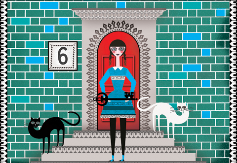
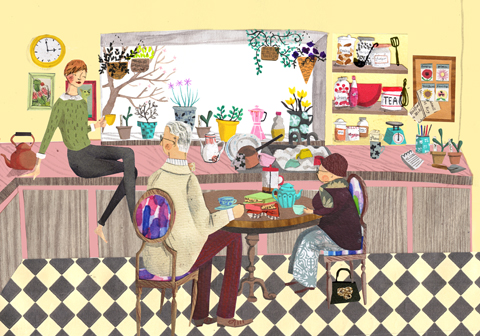
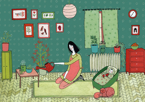
Suzanne Antonelli
Adam Batchelor
Joel Benjamin
Christopher Joyner
Stephen Mellor
Natsuki Otani

W.E.L.C.O.M.E was created in 2011 with the sole purpose of providing a new and innovative space for young upcoming artists to showcase and sell print editions of their work.

W.E.L.C.O.M.E is an online gallery and store that represents a small collection of new upcoming artists and designers from all kinds of media, we aim to provide a wide range of styles that tie in with our own philosophies of art.

For more info and to view work by W.E.L.C.O.M.E's artists, designers and illustrators please visit www.welcomegallery.co.uk

Stew is a not-for-profit, volunteer-run organisation which aims to be as inclusive as possible. This is embodied in the low studio and project space rents. All surplus monies are re-invested into materials, projects, improvement of the space and of course, food.
www.stew.org.uk


Ganbare Nippon: No. 58


This illustration is of a Corgi named Kou who disappeared with his owner on the day of the Tsunami, Kou's owner kept a blog about Corgis with many sweet pictures of him. The blog ended the day before the Tsunami, they were last seen fleeing from the wave. The artist drew Kou imagining how he would have grown in the year since the quake, she says that she hopes he is still alive and would like to imagine him grown up as the tsunami took so much hope away.

A year has already passed since that tragic day last year and we on the Rally would like to take the time to thank all our wonderful community from throughout the world for their support and commitment during our appeal and for the love that everyone has shown for the people affected by this terrible disaster.

Easter Rally No.2


30 Mar 2012

Easter Rally No.1

Eggies
This card is available for sale from her etsy shop.


Artist 135: Daisy Hardman


It's the exciting gestural work of Daisy Hardman now and this up and coming student has a real strength of both image and purpose, bringing her strong tonal compositions out to the viewer with more than a hint of dark visceral themes. Daisy has a way of gathering the energy of motion and spilling it out onto her work in an almost fervent manner that creates an inner tension in her work that puts the viewer on edge in a tense and excited state as their eyes scan her work to unlock the hidden detail, half created in the viewer's mind, half intentional, her work forms a backdrop to a constructed mindscape that allows the viewer in but not out. Her work having the great and instant effect of stealing some of your body heat and bringing you nervous energy in return. An exciting artist who has a great progression in her work and a bright future ahead.

Who are you:
Daisy Hardman, I am currently studying illustration at Kingston university.

What do you do:
I work in a number of mediums, but mostly as many as possible at the same time. I am interested in creating work that has a material quality and a sense of urgency in its creation with a huge input from accidental spillages and smudges (I am painfully clumsy!)

How did you start:
I have an awful memory, but I suppose I have always been interested in drawing with anything I can find and making a mess. Although it was only on foundation at Chelsea college of Art that I realized I was interested in illustration in particular.

A Personal statement about you or your work:
I work from life, primarily in black and white and I try and stay as far away from the computer as possible when it comes to creating. I don’t often plan anything I make, as I like creating work with a tactile quality and spontaneous marks that you only really work out through the process of making. At the moment I am finding printmaking, particularly etching, the best and the most enjoyable way to do this.

Links:
Portfolio
@DaisyHardman

29 Mar 2012

Open submission: Easter Rally

Illustration by Natsuki Otani

Hello everyone! Hope the readers who live in England are enjoying the weather, how's it like in other countries? It's nearly Easter and there are tons of chicks and chocolates all over the shops so  we'd like to announce our Easter Open Submission Rally too! You can create something for children or express your love for chocolates, if you don't care about Easter maybe you can let a chicken say how you feel... Please read our submission guidelines below, early submission gets early exposure so if you are selling Easter products please send us your work as soon as you can so you can make the most of it. Looking forward to seeing all the tasty chickens!

Submission Guidelines 
  • Any form of art is welcome, illustration, photography, graphic design, animation and more.
  • You can submit as many of your works as you like.
  • Your submissions don't need to be created for us, old work is welcome!
  • 72 dpi jpeg file please.
  • Send us your artist name and the links to your portfolio sites, if you are sending us your product, send us a link to the pages you are selling your Easter products on.
  • Send us your twitter name if you have one, so I can promote you on twitter effectively.
  • Deadline is 5PM Monday the 9th April.
  • Please send your work to illustrationrally@hotmail.co.uk with the title "Easter day Rally Submission"

Artist 134: Philippe Debongnie


A great artist feature for you now on the impressive Philippe Debongnie. Philippe has a great style. His work is easy to read and has a loose but effective quality. He can bring the viewer into his world of soft tone and strong features with his engaging yet light use of colour and an effective but restrained palette that helps not only to set his work up against vibrant collage imagery but also to provide his subjects with the right amount of context that means they are never overstated but nor do they fade into the ether. He has a great skill level and a draftsman's touch, able to capture both expression and form utilising as few strokes and lines as possible. He brings the viewer more visual treats when he uses his on trend patterns and graphics in juxtaposition with his figure work. All in all Philippe has an impressive style and will doubtless head from success to success but either way it is always a pleasure to feature highly skilled and dedicated artists so without further ado it's Philippe Debongnie!

Who are you:
Well, that really depends on which hour of the day (or night) we are talking about. But most of the time I am a Belgian illustrator living and working in Brussels (a city I love very much). I paint, draw, print and Photoshop images. I have three sisters, a beautiful wife, two young children and no pets. I traveled a lot, held numerous jobs and finally settled on teaching. I teach art and graphic desing in two different schools in Brussels (Saint-Luc and l’IHECS). When I do not teach, I draw and paint or I run the blog: jazzanddraw.com

What do you do:
I draw, I paint, I letter words, sentences, titles, I love drawing letters and I love portraits. I find the human figure to be so full of everything, I could draw portraits for the rest of my life and not be done with it yet. The way people think, behave, dress, talk, sing and all they do inspires me a lot and that really makes me want to portray them. That and I also love to trace lines on paper and see them coming to life. You can find the same tension, the same fascination in a good drawing as you do in life. Hopefully sometimes, I catch that. I'll keep trying anyways...

How did you start:
I have always been fascinated by books and more particularly picture books. It is not like I was always drawing, it is more like I was always thinking up stories and ways to render them not only with words, but also with images. And then when time came to choose my studies, I honestly hesitated between medicine and illustration. In order to take some time and choose, I went to the US as an exchange student for one year and during that year all I did was Art. This naturally brought me to study illustration for four years. I then worked as a graphic designer for a long time. I am now going back to my first love, illustration and I am happy with the way things turn out but every now and than I still question myself as to wether I made the right choice. I could have been a good doctor. Why not?

A Personal statement about you or your work:
I do not like to talk much about my work since I do consider I am not the best person to say anything about it but I'll say something here about what I aim for with my work. I draw, paint, doodle, sketch and paste it all together in Photoshop trying to keep a handmade look but also to bring more to it by digitally retouching it. The feeling I want to convey with these images is something like:"great, he drew that, well done, but how did he get that look? How does that work?" Handmade yet slightly disturbing in the end. You can see this in my Agnes Obel image attached.

Links:
portfolio
facebook
@pdebongnie
flickr

27 Mar 2012

Artist 133: Sarah Rosado


Feature time now with the wonderful and colorful work of Sarah Rosado. This New York based illustrator and photographer brings us her fun characters using digital imagery to provide a bright and vibrant illustrated style that is full of her enthusiasm and verve. She mainly works with women as her subject and uses her naive style to great effect picking out key details and providing the viewer images that provoke instant reaction. She is growing and her work reflects her exploration of style and we hope she continues to experiment and grow, wishing her the best of luck and opportunities in all she does, we give you Sarah Rosado.

Who are you:
My name is Sarah Rosado, and I am a illustrator and photographer from New York. I come from a family with artistic abilities. My father was a musician, my aunt, uncle, cousins are also artists. 

At a very young age I developed a knack for drawing. I was the only child among my other siblings who always decorated my notebook with drawings and even in class I was always doodling on what ever I could get my hands on. It sometimes got me in trouble. However, as I grew older, my desire to draw increased.

What do you do:
I'm an illustrator, photographer and digital artist.

How did you start:
My passion for art began to develop at an early age and I excelled in school during art class. I was awarded many certificates for my detailed drawings. But it wasn't until a couple of years ago that I decided to dedicate my career to art.

A Personal statement about you or your work:
There are many challenges out there with all kinds of exceptional artists and when I look at their work, I get motivated to do better. However, I don't believe that the challenge is a question about who's work is better, since each artist has their own unique style, the challenge would be which style of art is preferred by the people that view it.

Links:


9 Mar 2012

Shelter Up My Street Art Auction: Amelia’s Magazine Collaboration


 Photo courtesy of Amelia's Magazine

A bit of news now with Amelia's Magazine illustrators participation in a wonderful charity art auction for Shelter, packed full of life Amelia chose to theme the work around the concept of a safe secure home. So the wonderful illustrators all created their idea of a comforting safe home and the final piece brought together into one home. Amelia Gregory, Lesley Barnes, Emma Block, Yelena Bryksenkova, Natsuki Otani, Antonia Parker and Thereza Rowe collaborated to create the unique piece of artwork in aid of the Up My Street campaign by Shelter.

This month Shelter hosts an exhibition of artwork in the concept of Up My Street at the Coningsby Gallery. Amelia Gregory from Amelia's Magazine commissioned some of the lovely illustrators who were featured in her amazing books, Amelia’s Anthology of Illustration and Amelia’s Compendium of Fashion Illustration and we are delighted to have also shared their talents as contributors to Illustration Rally as well.

Close up entrance by Lesley Barnes

Close up room by Emma Block

Close up room by Thereza Rowe 

Close up room by Natsuki Otani

Close up room by Yelena Bryksenkova

Close up room by Antonia Parker

8 Mar 2012

Artist 132: Americo Neves


Americo Neves! Quite a feature now on the amazing character work of Americo Neves. Americo has a style that just jumps up and shouts, there is fun and colour, sharp lines and great creativity. Americo's characters have that up to the minute feel about them. They are cute and well designed, showing a great skill in isolating the important parts of a face, an expression or figure and exaggerating features or omitting others. Americo's work has it's fingers on the pulse and there is a great vibe and novelty about his work that gives him that creative edge. Character design is tricky to get right, there is a balance between style and the fact that it has to believably exist and move, the most successful characters always look at home and Americo has a real talent for getting his vibrant characterful work to provide its' own context. his characters and images have a great range and palette but always manage to stand on their own. So wishing him the best in all his upcoming projects it's Americo Neves!

Who are you:
My name is Americo Neves, born in the 70s' from Macao, in 1997 moved to England to continue my studies, graduated in 2001, holding a BA in Visual Communications from Kent Institute of Art and Design. After my studies I was employed in a publication company in Kent where I was responsible for magazine design, flyers, posters, logo design, etc, basically graphic design work. In 2003, decided to return back home and since then I worked as a full-time graphic designer.

What do you do:
I do graphic designer work for living and a bit of illustration and "art" work for fun as hobby.

How did you start:
I started in a formal way, from college to university and finally working full-time as graphic designer.

A Personal statement about you or your work:
My work has changed a bit since I started my career. Before I was more into graphic design, but about 5 years ago, I started to like drawing character design. Maybe because I won a toy design competition in 2007 organized by Coca-Cola and this motivates me to do more of this kind of work. The more character design I draw, the more I like and in 2009 I held my first solo exhibition in Macao based in character design in which I displayed about 60 characters. I didn't count how many characters is in my Harddisk, probably more than hundreds already. For the last few years, my working style is changing a bit from vector to photography and drawing, because wanted to experiment more conceptual and mixed media work.

Links:

7 Mar 2012

Artist 131: Michael Powell


Artist feature time here on the Rally now, and we have a lovely artist by the name of Michael Powell. Michael is a multifaceted creative, with a diverse working practice that includes poetry, narrative, installation, collage and illustration. He has a working practice that seamlessly integrates all these disciplines into a cogent message, a sort of unity pervades his working style and Michael's work gives a sense of serenity in all of it's aspects. His illustration particularly drips with narrative, allowing the viewer to feast on the story as well as the imagery. Michael's work is self supporting like a geodesic dome of naturalistic intertwining fantasy, each working style supports and compliments the next and the combination of all with the same subject is the strongest. In this way it would be possible for him to tell a story from several angles, examining and developing the theme over different media. An extremely promising artist with a joined up style that works well, we give you Michael Powell!

Who are you:
Michael Powell.

What do you do:
I like to write stories and poems, draw pictures, paint creatures and make collages and installations.

How did you start:
I began with writing, but I always liked to draw. When I was little I was obsessed with drawing the starship enterprise and dinosaurs. When at uni, I met lots of amazing people who all drew, and then so did I, and found that the more I drew, the more I could combine this with my stories.
Things have developed from here really. I currently attend an imaginary drawing school, a place where i set myself projects based upon things I am interested in. The tutors are great, but the classrooms are hard to find.- see my tumblr blog for more info.

A Personal statement about you or your work:
I am currently very interested in and influenced by Norse God, Aztec and Celtic myths, Hermann Hesse, Jorge Luis Borges, Alan Watts, music, the natural world and the play, nonsense and flow of reality as it crashes against my everyday life.

I enjoy using my imagination to create stories and drawings of another world made up of mythic and hybrid creatures, images and objects. Inspired by nature and its different connections, movements and relations, in an attempt of interpreting and explaining the world around me.

Links:
portfolio
blog

Exhibition News: JCRUZ retrospective and group exhibition


News time now with the fabulous JCRUZ, whose scarves are fast becoming hot property. With the launch of RISE & FALL  Joe Cruz has pushed his designs to new heights with their vivid colours and pop themes. A kind of sardonic swipe at modern candy-floss celebrity culture with more than a touch of great craftsmanship. Lovely objects by a great artist that you can see in person as now we bring you news from the Debut Contemporary in Notting Hill where JCRUZ will be taking part in a group exhibition between 6:30 and 9:30 on Wednesday the 7th of March. The images above are a retrospective from the launch of the new RISE & FALL collection. Below is a short press release from JCRUZ.

"During London Fashion Week February 2012, JCRUZ will launch its first ever collection, RISE & FALL, featuring a range of beautiful silk printed luxury scarves. The scarves are Made In England and feature the artist’s signature. Inspired by the bitter sweet highs and lows of a celebrity obsessed nation, artist Joe Cruz, presents his ideas in textile form using classic forms, bold line and bright colours."

So what are you waiting for! Get out there and see a slice of fresh hot art!


Links:

6 Mar 2012

Artist 130: Cachetejack


It's Cachetejack now with their own brand of naive style that gives the viewer a crisp cutting edge experience with a light and fun flavour. Cachetejack have a slick way of giving the onlooker a smile, and their work has a real sense of life and fun about it that compares favourably with the more common use of naive style to give subtle hints without real attempt at comedy, they bring together some great talents with styles that work in concert to give a really nice package and a body of work that is both cogent and clever. They have some lovely publications that stress both thier talent at keeping up with thee current styles and their strong use of colour with some lovely palettes that really set them out from the crowd. Cachetejack are on the scene to stay and it will certainly be worth keeping up with them in the future as they are sure to be busting out with some more strong work. So without further ado it's Cachetejack!

Who are you: 
Cachetejack is Nuria Bellver & Raquel Fanjul, a bunch of illustrators based between Valencia (Spain) and Prague ( Czech Republic). We try to enjoy with our creative process to get funny and ironic images for the viewers.

How did you come together: 
We met at university 6 years ago but we started to work as Cachetejack one year ago. Our goal is work together since the last day of the world!

What is the manifesto: 
We wrote some manifestos because we don't like how art is considered in our century, so we talk about the commercial antique system as old-fashioned. We are living in XXI century and internet offers new ways to young artists that we have to learn to use!

Links: